The Brief
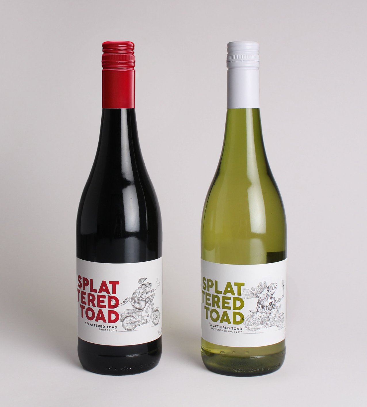
Cape Point Vineyards approached our team to relook, reposition, and redesign their wine labels for Splattered Toad — a range of two concept wines, namely a Shiraz and a Sauvignon Blanc.

The Rationale
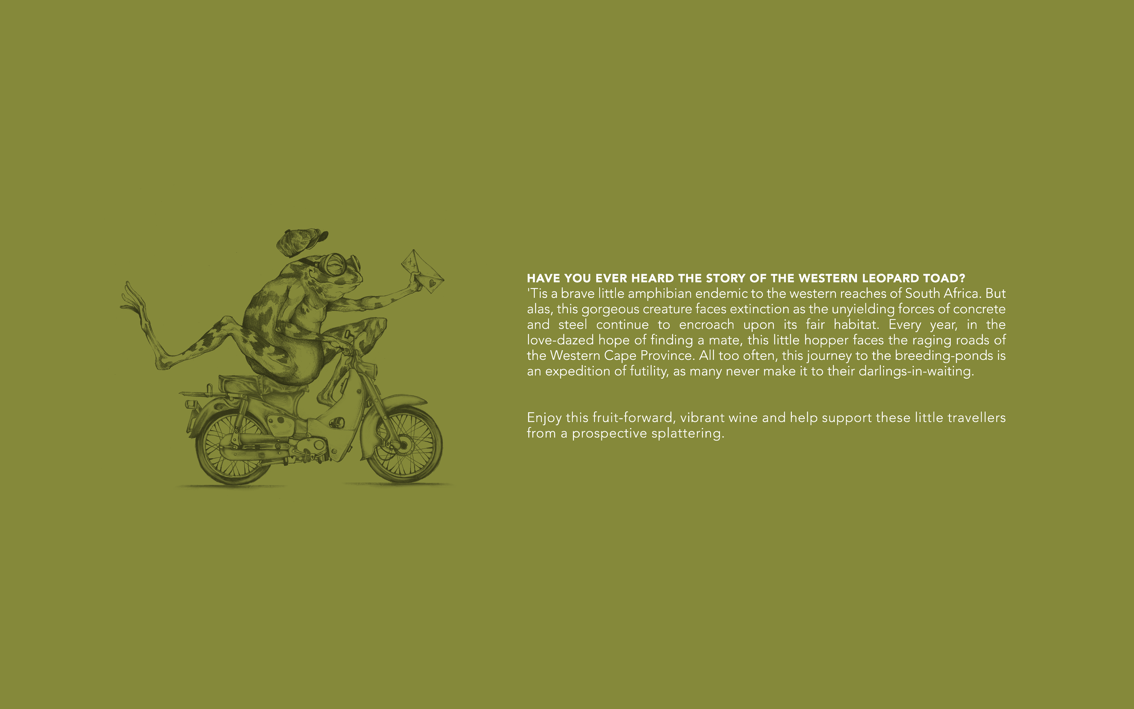
As a brand, Splattered Toad is purposed with creating some much-needed awareness around the increasing vulnerability of the Western Cape Leopard Toad as an endangered species. Thus, the majority of the proceeds collected through the sale of this wine go to funding further research and conservation of this species.
The final design features an illustration of a toad riding a motorcycle on his way to meet up with his mate. This is accompanied by a quirky-cute piece of copy (as seen below) on the back label that tells of his often tragic tale.
FOR THIS PROJECT, I WAS RESPONSIBLE FOR:
CONCEPT DEVELOPMENT & LABEL COPYWRITING.
THIS PROJECT WAS COMPLETED IN 2018 WHILE I WORKED AS A COPYWRITER FOR WHITESPACE CREATIVE.
NENA MAREE WAS THE ILLUSTRATOR AND CAM FINEZZI JONES WAS THE LEAD DESIGNER.