The Brief
As an already-established artisanal beer brand, Flat Rock Brewery was created to represent Cape Town within the overflowing craft beer industry. Due to competition and inferior branding, the owners of Flat Rock knew they needed an update. But being an ambitious team, they approached us to create a brand that was, in their words, "award-worthy". So that's what we did.
Awarded Gold for Beer in a Series at the Beer Label Design Awards 2019
The Rationale
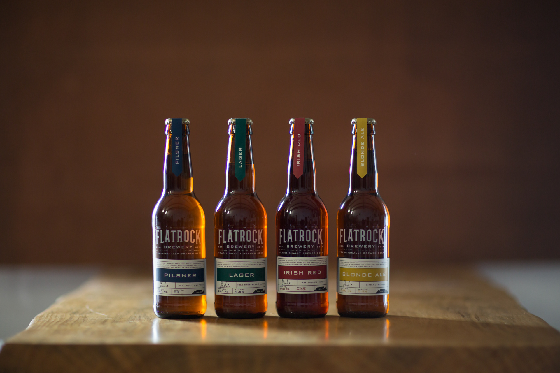
Flat Rock Brewery, named after the devoted Table Mountain, brews traditionally in recognition of the fact that "crafting beer" is simply nothing new. As such, they have stuck to what has been done for years – Reinheitsgebat, or "the Purity Law" is a German method of making beer through restraint. Only making use of four ingredients; hops, barley, water, and yeast means little room for error, yet their ability to produce four unique brews is a testament to their skill as artisans.
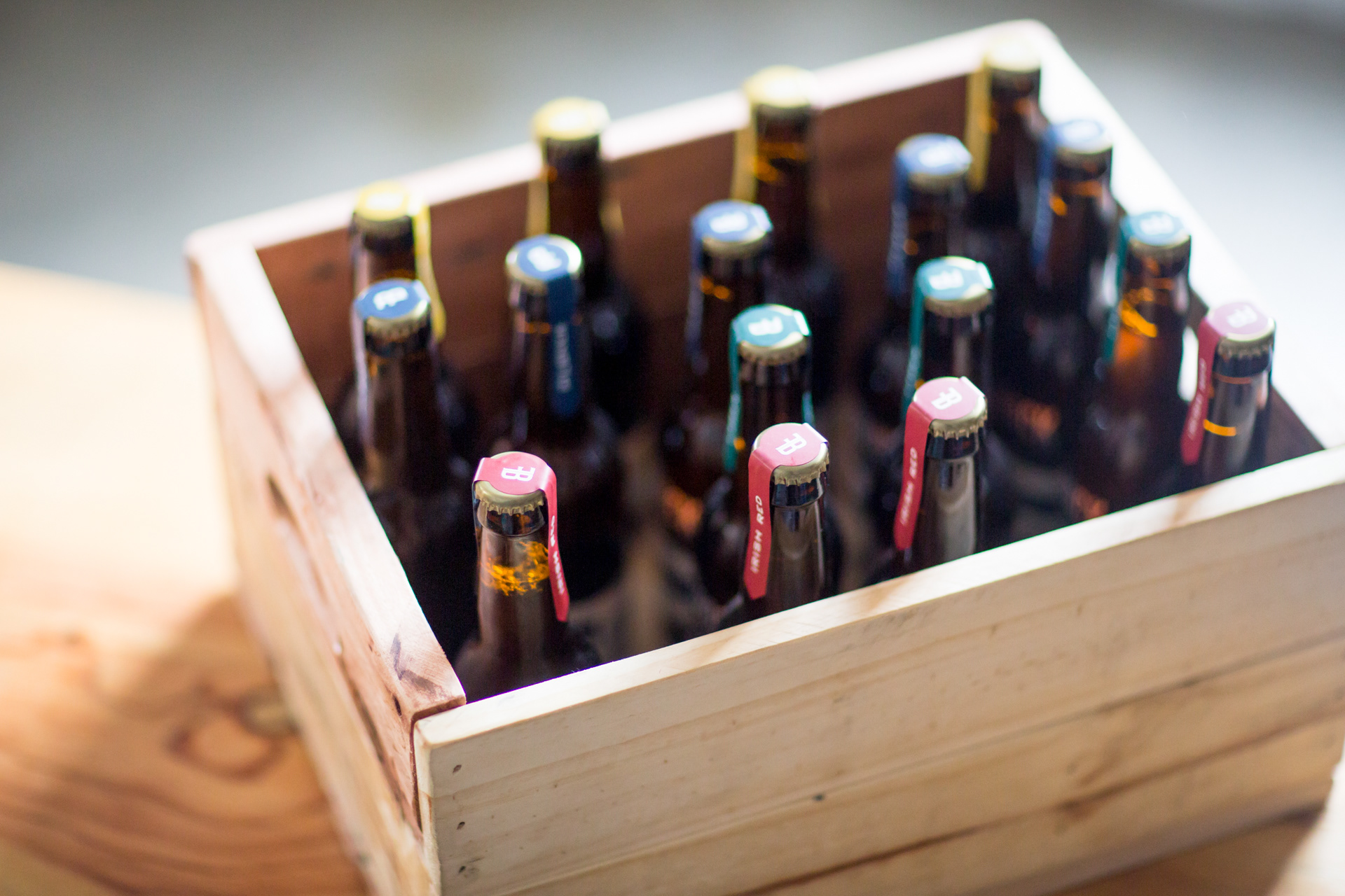
The concept was inspired by combining the notions of old and new. The screen-printed logo intentionally resembles Table Mountain, in that it is bold and, well, flat. The serif typeface adds structure to the overall design while remaining minimal and traditional, just like the brewing process and its ingredients. Each SKU emanates its offering through its label and use of timeless colouring: navy blue, British racing green, carnelian red, and medallion yellow. It's the perfect marriage of traditional technique and timeless design.

FOR THIS PROJECT, I WAS RESPONSIBLE FOR:
CONCEPT DEVELOPMENT, CONTENT CREATION, PHOTO SHOOT ART DIRECTION & COPYWRITING.
THIS PROJECT WAS COMPLETED IN 2019 WHILE I WORKED AS A COPYWRITER FOR WHITESPACE CREATIVE.
KYLA ACKERMAN WAS THE LEAD DESIGNER, MELISSA MAY WAS THE GRAPHIC DESIGNER & SEAN HARRISON WAS THE CREATIVE DIRECTOR.