The Brief
Oldenburg Vineyards had never before produced a range of concept wines. The result of a comprehensive brand strategy, this brief was to develop a sub-brand of concept wines that represented the farm's region, that was 'cool' and 'trendy', and that would solve the farmer's leftover grape problem.
Awarded Bronze for Wine in a Series at the Wine Label Design Awards 2019

The Rationale
Nestled in the Banghoek Valley, Oldenburg Vineyards is an off-the-beaten-track, family-run wine farm.
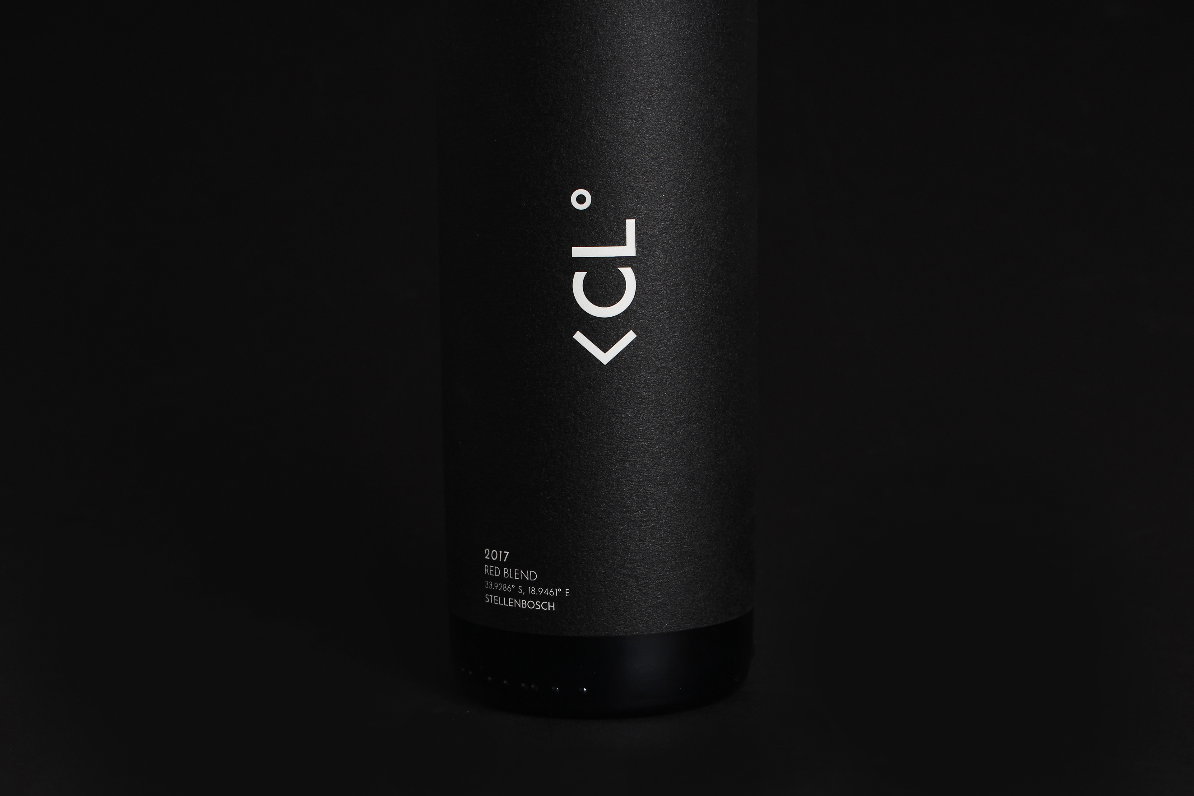
This label is understated and bears a contemporary visual, yet it is cheeky in its tone. Named 'CL', this range is inspired by a play on the farm's location within the Stellenbosch region. It is also a play on the word 'cooler', as the farm is situated in the Banghoek Valley at a higher elevation. Hence, the property experiences colder temperatures than the rest of Stellenbosch's wine farms. This creates a distinct advantage in the production of quality grapes.
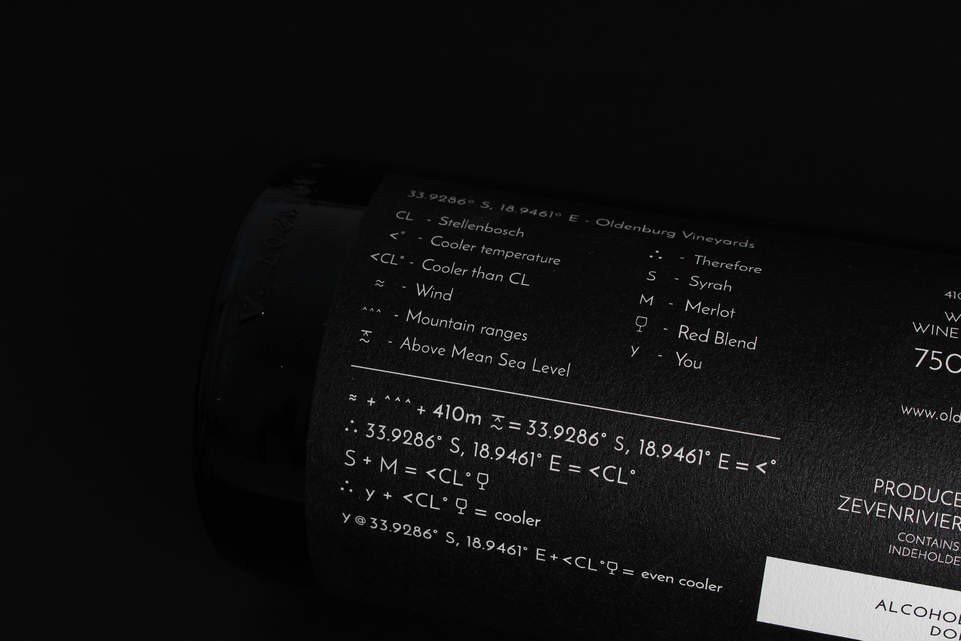
The symbols '<' and '°' were used to read as 'less than Stellenbosch temperature' or 'Cooler Than Stellenbosch'. A sleek, scientific look was applied to the logo, and a mathematical equation was used for the back label's copy that describes the relationship between the climate and the wine.
FOR THIS PROJECT, I WAS RESPONSIBLE FOR:
CONCEPT DEVELOPMENT, BRAND STRATEGY & COPYWRITING.
THIS PROJECT WAS COMPLETED IN 2018 WHILE I WORKED AS A COPYWRITER FOR WHITESPACE CREATIVE.
WILMA DE NYSSCHEN WAS THE LEAD DESIGNER, AND SEAN HARRISON WAS THE CREATIVE DIRECTOR.